Onoda – Japan Store for Living and Wear
Onoda is a charming little Japanese store in the old town of Zurich. We were asked to develop the branding for Onoda. Onoda offers authentic Japanese everyday products made by small businesses and craftsmen all over Japan.
O means small in Japanese, Onoda means small rice field and is the last name of the owner. We put this O at the center of the branding, as a letter and as a Japanese character 小. This character is associated with growing grasses, but also with mountains. Onoda is small but nice – this applies to the name, the store, the alley where the store is located, as well as to the owner herself. We chose a rough uncoated paper as the material for the business cards. The icon was embossed tone on tone with a noble shine on the card. We also designed the shop window, a sign for the outside labeling or the carrier bag.
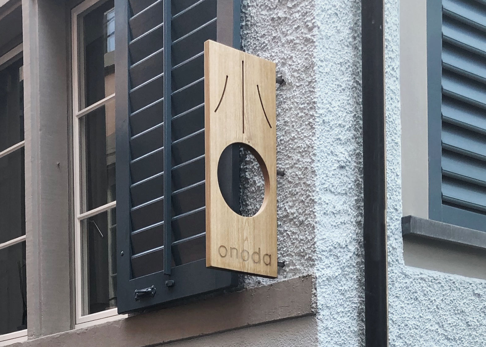
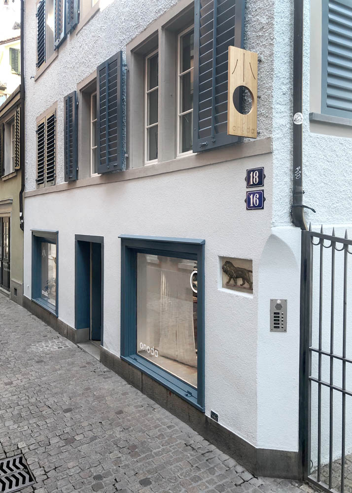
Ash wood sign for store labelling.

Business card front with foil embossing reflection.
Business card backside.

Business card front side.

Carrying bag

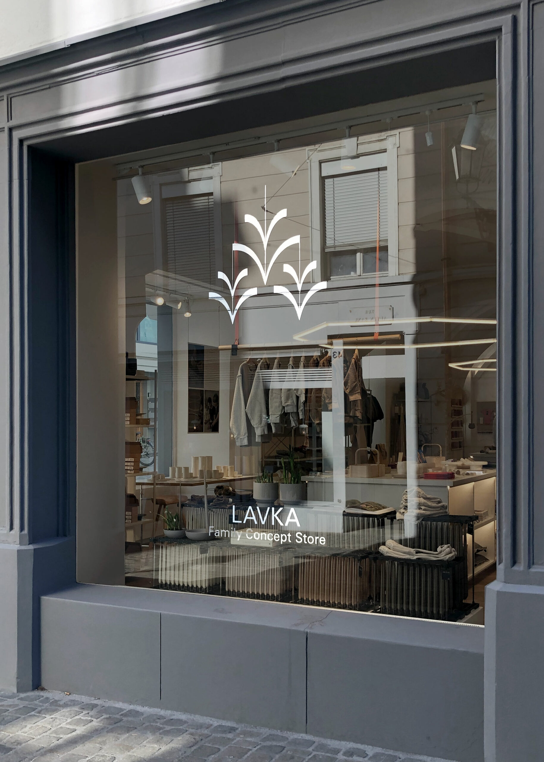
Signs on shop windows and entrance door.

